Wednesday, July 21, 2010

1. The State of Iowa contains 99 counties
2. As of 2001, the county in Georgia that contains the largest number of people is Fulton County.
3. In the State of Washington there are 39 cities with a population greater than 15,000.
4. All of the interstates taht are crossed by the outline of Los Angeles total to 3851.14 miles.
5.1367446 acres of urban area lie within Los Angeles


6. 522 zip codes have their centroid in Los Angeles County.
7.


8.Doncaster Indian Reserve 17, Kitigan Zibi Indian Reserve, Kahnawake Indian Reserve 14, Kanesatake Indian Reserve 16, and Akwesasne Indian Reserve 15 lie within 75 miles of the city of Thurso in Quebec, Canada.

Monday, July 19, 2010

Population Densities US Counties


This map shows the population percentages of the "other" group by counties from the US 2000 census. The "other" group is defined as citizens who did not identify with any of the listed ethnicities on the 2000 US census survey such as White or Asian. Based on the distribution of populations in this map it is likely that the majority of persons in this group are Latino and come from either Mexico or Central America. The concentrations of populations near the Mexican border suggest this population is made up primarily of immigrants. This is illustrated by the darker- more densely populated- regions. The combination of the map of the United States and all of its counties with information in the form of xcel tables from the US Census has been transformed into this map through ArcMaps. The visualization of the data allows us to more easily see patterns in population distributions.


This map is a visualization of the data from US citizens that identify themselves as "black". As the map shows, the majority of "black" persons reside on the East coast and the South. States such as Louisiana, Alabama, and South Carolina have the darkest blue areas and therefore the highest densities of "blacks". There are between 0-8% "black" populations in the Midwest and West states but California has a higher number, mostly around Los Angeles and San Francisco. The visualization of population densities with this map allows us to easily see population distributions.


This map shows the distribution of population percentages for US citizens that consider themselves to be "Asian". The map shows concentrations of "Asians" on the coasts of the US. The West coast is a little darker indicating a higher population percentage of "Asians". This is likely the result of immigration from Asia via the Pacific Ocean. Once again, the areas around Los Angeles and San Francisco are the darkest as these cities not only have high populations but are also very diverse.

These three maps show the populations percentages by US Counties for three different groups, "Asian", "Black", and "Other". By using color schemes on these maps to show ranges of population densities we can effectively visualize data such as this data taken from the 2000 US Census. The ArcMap program provides a user interface with which to combine maps with data. This is one example of the practical uses of GIS. With these maps we can more easily make conclusions about the data from the 2000 US Census than we could have with only the data tables themselves. This census map series has shown me the possibilities and applications of GIS. There is vast amounts of data easily accessible through the internet such as the census information that can be interpreted through the use of GIS.

Thursday, July 15, 2010


Equidistant map projections


The Equal Area map projections


The Conformal Map projections

These six maps represent the different ways in which the spherical surface of the Earth can be projected onto a flat surface. The maps are grouped into three categories, Conformal, Equidistant, and Equal Area. These three types of maps are categorized based on their method of projection. Within each of the three types of projections there are various levels of distortion. The specific map projections such as Mercator or the Lambert Azimuthal Equal-Area, are designed to preserve certain areas of the map while leaving other areas distorted. There are several different map projections, each made for a specific use.
The conformal map projections maintain angular relationships and for this reason are good for navigation. The Mercator map is a common conformal map. The mercator map uses a cylinder to project the the Earth onto. Because the mercator map style uses a cylinder, the map is distorted at the poles, making the land appear larger than actual and it is preserved at the equator. This can be seen at the poles where the 30x30 degree squares are elongated. The second conformal map shown above is a stereographical map. The stereographical map preserves the relations toward the north and south poles and there is more distortion towards the equator.
The equidistant map projections, as the name suggests, preserve distance from the center of the projection. From the first of the two equidistant maps, the equidistant conic, you can see that the distance is preserved from the north pole. This map was created using a conic projection. The second equidistant map shown is called plate carree. In this map the horizontal and vertical lines are equally spaced. Each square is 30x30 degrees and the map is preserved near the equator and stretched at the poles.
The third set of maps shown are classified as equal area maps. These maps are created to have the same area on the map as on Earth. With the Gall projection you can see that the poles are preserved while the closer to the equator you get the more distortion there is. This is why the 30x30 degree squares are stretched in the center of the map and small at the poles. The Hammer projection preserves area in the center of the map more then on the edges. The lines of latitude and longitude on the Hammer map are curved unlike the other map projections help illustrate the curvature of the Earth on a flat surface. As seen, each map has its advantages and disadvantages and for this reason different maps are used for different applications. The reason for the difficulty in accuracy with maps is the projection of a sphere onto a planar surface. The different styles of projecting the Earth onto a planar surface have been developed in order to preserve certain qualities of the map for use in specific fields.

Wednesday, July 7, 2010


The ArcMap tutorial was my first introduction into GIS. It didn’t take me long to realize the potential of the ArcMap program and GIS. ArcMap is a complex program and I have only began to explore it, but what I have learned so far has shown me the many levels of information that can be stored in a map. These levels are both literal and metaphorical. There are layers of information in the form of layers on the map that can be viewed individually or as a whole. In this tutorial some of the layers were land use, noise contours from the airport, and schools, among many others. There were also layers of information within each of these. When I clicked on the one school that was within the noise contour of the airport I accessed information such as the name of the school. Furthermore, information can be reviewed and conclusions can be made based on that information from the map.
The format of the ArcMap program was surprisingly similar to many other programs I have worked with on my pc. This made it easier for me to understand how it works. While going through the tutorial I found the instructions for the practice maps and exercises easy to follow. The program does seem very complex however because it has so many options and tools. Learning the basics of the program such as labeling, rendering, and positioning was simple, but the program offers much more complex tools that I have yet to learn and that will likely take some time for me to understand.
Once I have spent a considerable amount of time using ArcMap I can see the benefits it will have in terms of GIS. This program is the basis for creating and modifying data maps. Although the process of creating these maps is very time consuming, the uses for the data that is stored in them is tremendous. The map used in the tutorial contained a wealth of information about a fairly small portion of land. This information can be used to guide urban development based on the noise contour of the airport. One thing about the ArcMap system is that it does take a considerable amount of time to create and it is only accessible to people who have the program and have been trained. This is a problem in GIS because programs used in GIS such as ArcMap are not quickly learned and so the information contained in them is not readily accessible.
There are more pros then cons in GIS and the ArcMap program however. The amount of information and the visual and textual presentation of this information allow ArcMap/GIS users to create, summarize, and access large amounts of data for certain areas. This accessibility to data helps us to understand our environment better. GIS makes it easier for us to comprehend the interactions between different aspects of our communities such as schools and transportation. We can then use the information from GIS to improve them. This is possible because GIS allows us to see things like the progression of deforestation over time or increases in population which help us to quantify things we can’t see in our daily lives. The accumulation and presentation of data displayed in GIS, although time consuming to construct, gives users a tremendous amount of information that can be used to improve our environment.

Wednesday, June 30, 2010

Lab 2a: Google Maps


View Surfing LA in a larger map


Neogeography is a term used to describe a new type of geography that allows people to create their own maps from existing ones simply by using an existing toolset. There are several pros and cons in neogeography. The ability for a user to create his/her own map allows for the personalization of maps. In a relatively short amount of time someone can create a map that shows all of their favorite places such as restaurants. This can then be shared with others. Neogeography allows for an exchange of information through personal maps in a short amount of time. If someone wants to give a group of people directions somewhere they can make a personal map and post it on the web.
Personalized maps can be very useful but neogeography has it's cons as well. The spread of personal information through neogeography could fall in the hands of the wrong person and lead to fraud or other illegal activities. Although neogeography creates some useful maps, these user generated maps are not always correct and the circulation of incorrect maps on the internet is a posibility. This is comparable to websites such as wikipedia which offers a wealth of information but isn't always correct. Personal maps are usually not suitable for research and do not convey vast amounts of information like the USGS topographic maps do. Neogeographic maps are similar to mental maps and therefore are one persons creation, not a standard to be used by everyone.

Monday, June 28, 2010

Lab 1b: USGS Topographic maps

1. What is the name of the quadrangle? Beverly Hills Quadrangle California 7.5-Minute Series (Topographic)

2. What are the names of the adjacent quadrangles? Canoga Park, Van Nuys, Burbank, Topanga, Hollywood, Venice, Inglewood

3. When was the quadrangle first created? 1966

4. What datum was used to create your map? Metadata

5. What is the scale of the map? 1:24,000

6. At the above scale, answer the following:

a) 5 centimeters on the map is equivalent to how many meters on the ground? 1200

b) 5 inches on the map is equivalent to how many miles on the ground? 1.89 miles

c) one mile on the ground is equivalent to how many inches on the map? .0000416

d) three kilometers on the ground is equivalent to how many centimeters on the map? 12.5

7. What is the contour interval on your map?

20 ft

8. What are the approximate geographic coordinates in both degrees/minutes/seconds and

decimal degrees of:

a) the Public Affairs Building? Lat: 34.07422 Long: -118.44016 Lat: 34,4’,27.2”

Long: -118,26’,24.6”

b) the tip of Santa Monica pier? Lat: 34.00768 Long: -118.49967 Lat: 34,0’,27.7”

Long: -118,29’,58.8”

c) the Upper Franklin Canyon Reservoir? Lat: 34.12099 Long: -118.49967 Lat: 34,7’,15.6”

Long: -118,27’,19.6”

9. What is the approximate elevation in both feet and meters of:

a) Greystone Mansion (in Greystone Park)? 600ft 182.88 m

b) Woodlawn Cemetery? 140ft 42.672 m

c) Crestwood Hills Park? 700ft 213.35 m

10. What is the UTM zone of the map? 11

11. What are the UTM coordinates for the lower left corner of your map?34,1’,18”

12. How many square meters are contained within each cell (square) of the UTM gridlines? 1,000m2

13. Obtain elevation measurements, from west to east along the UTM northing 3771000,

where the eastings of the UTM grid intersect the northing. Create an elevation profile

using these measurements in Excel (hint: create a line chart). Figure out how to label

the elevation values to the two measurements on campus. Insert your elevation profile

as a graphic in your blog.


14. What is the magnetic declination of the map? 13,12’

15. In which direction does water flow in the intermittent stream between the 405 freeway

and Stone Canyon Reservoir? From North to South

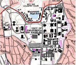
16. Crop out (i.e., cut and paste) UCLA from the map and include it as a graphic on your

blog.